Working with Data
Student drill down
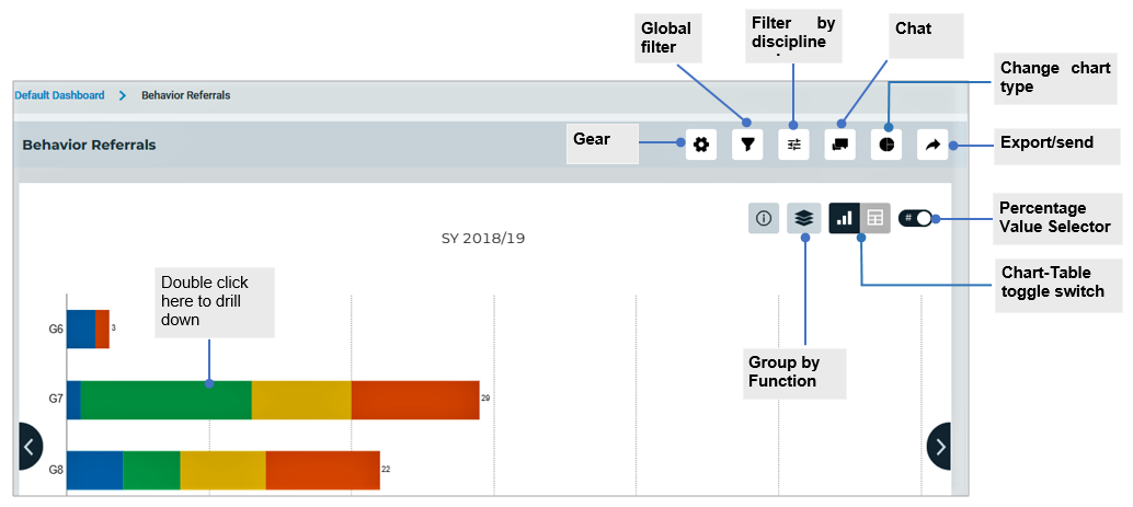
Navigate the dashboard and select an indicator. Click on the indicator’s name and you will be taken to another page with a new set of user interface. The following are the controls in the user interface:

Toggle between a chart and table in dashboard Visual table shows you the data underlying a chart. To toggle between two different visuals from chart view to data table and vice versa, click the Chart-Table.
Percentage selector Percentages allow for a quick and accurate understanding of how much data sums have changed across a dimensional category. To toggle between the display between numbered data and percentage, toggle the Percentage Value Selector.
Change chart type The change chart type graphical control lets you select such options as whether you want your information displayed as pie chart, column, or as a bar chart. Click the Chart button and select the desired chart to be used in the current chart, then click Update Chart button. Any changes made to chart type will reflect in the main page of the dashboard.
Cohort vs Non-cohort You can compare multiple measures between cohort students with non-cohort students. Click the Gear button and choose Cohort vs Non-cohort, then click Groups field and select available groups in the dashboard. Once you’re done, click Submit.
The chart will be updated based on the parameter.
Time Comparison You can chart two or more data series on the same chart so that the trends from those series can be visually compared. You can create a chart that presents a side-by-side time comparison of three time periods.
- Click the Gear button and choose Time Comparison, then fill in the required information. Once you’re done, click the Submit button.
If you want to revert the changes, click the Gear button and then choose Reset.
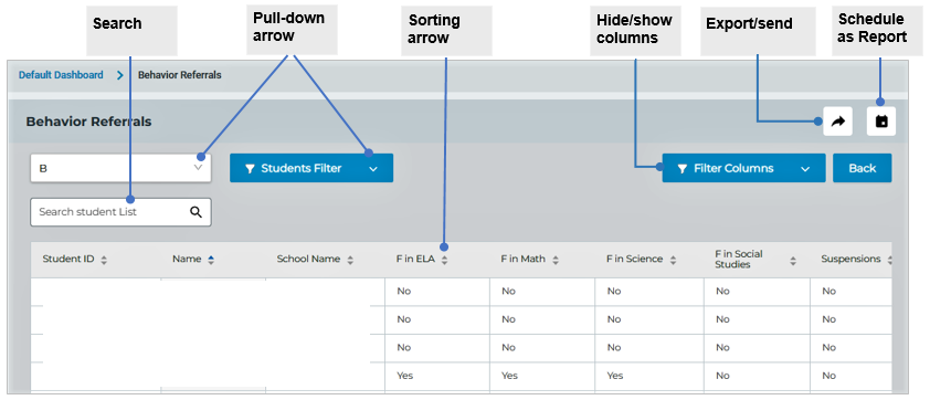
To drill down into the next level of detail, double click on a slice or column. You will be taken to another page with new user interface. With drill-down you can easily see the data that made the chart in a tabular format. The following are the controls that can be used in exploring data points and view row-level data in the grid.

Filter Columns. Click on the pull-down arrow for the column you want to filter. A pop-up box appears. Check the boxes next to the data you want to filter. The data will be filtered, hiding any content that does not match the criteria. When data is filtered, only rows that meet the criteria will display and other rows will be hidden. You can analyze your data better using filter columns.
Sorting arrows. First, choose the column that you would like sorted. Click on the arrows over the column you wish to sort. The two small arrows is an indication that this column is available for sorting. When the arrow is clicked, the rows in the table are ordered ascending by the specific column values. If the same label is clicked again, the order is reversed.
Send/export. The arrow allows you to export or send the current data in the table in CSV or Excel format.
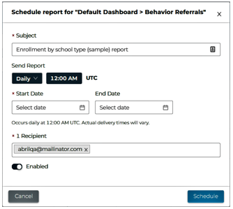
Schedule as Report. You can set up a report to run itself daily, weekly or monthly and send the results automatically to the people who need to see them, so that you don’t have to remember to log in and do it yourself.
